
Your custom home is a reflection of you: your taste and style, including the building materials you choose – glass, wood, brick, stone – as well as the colors you choose. Interior design is one of the last things many people consider, but considering the final look of your home, including colors, from the home’s design stage, is beneficial to turning the key on a final product you can relax in and call home. Your basics, like the color of your cabinets and closet doors, the colors of counters and tile, faucets, and everything else installed during construction can have an impact on your overall interior design, especially the colors you ultimately choose. Red, blue, and yellow mix to make up all the colors of the rainbow, and all of its many shades and hues. My favorite color has been purple, the mix of blue and red, for years. I also enjoy blues, reds, and greens.
Here are some tips so you don’t dismiss the role color plays in tying it all in to one cohesive space.
Table of Contents
Color Psychology
What’s your favorite color? Why? As I said, mine is purple, but before now I never really thought about why. I once ended up at a job interview that was more of a cattle call for mindless survey solicitors (the kind that badger you to sign petitions for X Cause while you’re headed to the bathroom at a football game). It’s the only interview I intentionally set out to fail once I realized what it was about. Why hadn’t I looked in to the company beforehand? I did. Everything I found solidified that this job was something I wanted, so I attended the ‘interview.’
These questions came up. What’s my favorite color? I didn’t lie or joke, I said purple. Why? This is where I made it a little fun, and I’m sure frightened the interviewer: I said that it’s the perfect mix of red and blue, two of my other favorite colors, representing the cool, calm, mellow side of me (blue), and the side of me that can be quick to anger and frustration (red). The interview proceeded, but by only a few more questions and a promise to let me know. I never got a call or an email.
But beyond making up crazy statements to get out of a situation you were tricked into, there is solid evidence and theory about how color affects everything from mood and cognitive function to creativity and productivity. Evoke calm and relaxation with green and blue. Pump up the energy and passion with reds, oranges, and the like. Keep things on an even keel with neutrals like gray, white, or beige for a sense of serenity.
Like the general study of psychology, color psychology is based on the scientific effect of something – colors and their many hues – on the human brain. Also as in general psychology, the effects of the colors may seem similar across different types of people, studies have show that individual people respond differently to what even designers consider ‘standard’ color schemes.
More Than Paint
The color palette extends beyond just the paint on the wall. Yes, that’s likely the largest amount of square footage to color, but the color of materials like carpets, flooring, furnishings, accessories, and more need to be considered as well.
If you’re working with an interior designer, you’ll discuss not just paint, but all of the things mentioned above and more. They’ll offer samples of materials so you can see how colors and hues go together in a cohesive design.
Deciding on a Color Scheme
No matter what your favorite color may be, there is such thing as too much of a good thing. As I’ve said, my favorite color is purple, but if you walked into my house, you may not know it. First, it’s a rental, so the color on the wall is what I call Rental Gray. Flat gray that covers every square foot of wall space, from the kitchen and living room up the stairs and in all the bedrooms. Rental White can be found in the bathrooms and laundry room. If I could change it? I would likely not use purple, or not much, on the walls, and only in certain spaces.
Instead, I’d go for blues or greens, maybe reds for larger canvases like walls. But that’s me; you may want to be surrounded by purple or whatever your favorite color may be. Instead, I’ll opt for my purple in textiles like bed sheets, throw pillows or blankets, and other accessories. Purple paint may find it’s place in smaller spaces where it won’t be as overwhelming, or as features.
As discussed previously, your color scheme includes your furnishings. A dark-colored couch is the perfect canvas for pastels or lighter colors to offset the moodiness. A lighter neutral is calling out for pops of bright, bold colors. Even the stain of the wood is a color that needs to blend naturally with the colors in your palette. No matter what your favorite color is, there are ways to make it the main focus or weave it in with expert subtlety.
Popular Colors to Consider
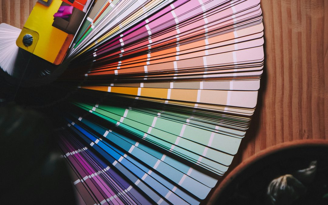
The primary colors you learned about in kindergarten are red, blue, and yellow. The secondary colors – colors made from combining those colors – are orange, green, and purple (my favorite, if you didn’t know!). Pair these with traditional neutrals like black, gray, beige, or white, and the color palette of your home will take center stage.
Black
Elegance, functionality, and simplicity. It’s a popular go-to for modern interior design and architecture. Many designers and architects will even wear black to direct the attention toward their designs rather than themselves. When you get down to the nitty-gritty psychological aspects of the color, designing an all-black palette can get overwhelming and gloomy quickly.
Black does, however, have positive emotions associated with it. Beauty, control, desire, elegance, efficiency, modernism, protectiveness, and sophistication. Depression, grimness, and terror are easily evoked as well, so use black carefully in your design.
Tips for using black:
– Break it up with white (or nearly any other color)
– Add black to kitchens, living rooms, dining areas, and bathrooms to exploit its association with form and functionality
– Take advantage of lighting (both natural and artificial) to lighten up the space
Gray
Gray is a neutral color that evokes a wide array of emotions. As with many colors on this list, various hues as well as applications (where you use it in your home) can result in different responses. Like black, gray and many of its variations reflect form, functionality, and simplicity while also conveying elegance, sophistication, and style. Other positive emotions include determination, power, rigidity, and strength. Negative impressions from gray include, like black, depression and gloominess. Used correctly, gray can be the ultimate relief for bright and vibrant color schemes.
Tips for using gray:
– Avoid light gray on walls
– Use a darker shade complemented with vibrant shades of pink, yellow, white, and others
– Choose gray furnishings for elegance,neutralization, and sophistication
– Limit the color to textiles and accessories rather than walls or ceilings
– If using gray as a focal color provide plenty of natural light for warmth and welcome
White
Head to the paint department of any home improvement store and browse the paint chips. The store likely carries multiple brands of paint, and each brand carries a number of shades of white or cream. For example, Dunn Edwards provides ten shades of “High Hide White” like “Swiss Meringue” and 100 shades of “whites” including “White Heat”. Many of these whites are standard starting points for walls and ceilings, ready to be modified with the many other colors we’ve talked about in this article with textiles and accessories for your personalized look.
White brings feelings of cleanliness, harmony, hygiene, peace, and tranquility – key reasons why it is an oft-included color in Japanese architecture, spa facilities, and Scandinavian cultures for its symbolism of simplistic living. It’s been shown inhabitants surrounded by white are rarely disturbed by extremities and excitement.
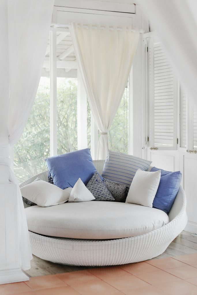
Other positives conveyed by white include brightness, openness, and the ability to ease feelings of claustrophobia, eases anxiety and hypertension, and regulates heart rate. Control, effectiveness, fraternity, functionality, trust, and openness. White offers a “blank canvas” that encourages challenge, creativity, efficiency, and productivity. White is the perfect color for any room. It can serve as a base, as well as increases visual space while reducing tension.
Tips for using white:
– Pair with any other color for unmatched vibrancy
– Pair with gold, gray, or yellow for feelings of elegance, luxury, and prosperity
– Pair with red, orange, green, and others for vivaciousness and energy
– Create a calming space with blues and muted tones
Red
The primary, yet controversial, color evokes different feelings in different people, often depending on their mood. The strength of red can evoke feelings of desire, joy, love, passion, sensitivity, or sexuality. If you’ve ever wondered why it’s a primary color in the palette of Valentine’s Day, it’s the perfect color for lovers! Other positive emotions associated with the color red are courage, energy, leadership, strength, and vigor.
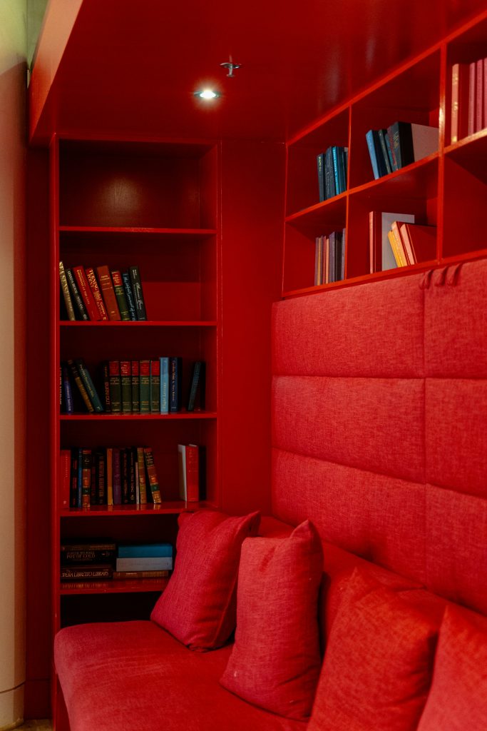
But there’s a reason the sentiment “seeing red” is a negative. Red is also associated with the negative feelings of anger, malice, rage, wrath, and even danger (stop or yield signs, other warning signs posted in dangerous spaces) and war. These negative emotions should be balanced with neutrals like white and beige that offer a calming effect.
Tips for using red:
– Pair it with gold, brass, or gilding for a sharp, regal look
– Use white as a relief neutral to break up the harshness
– Add red to the kitchen with appliances like the stove, stove hood, stand mixers, and more
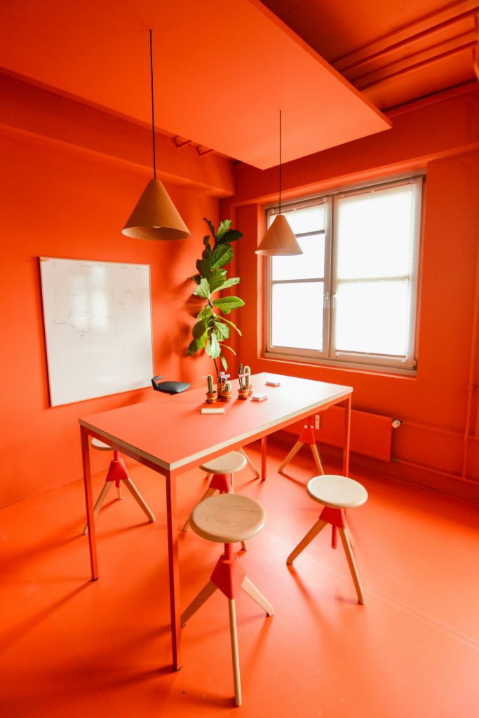
Orange
The vibrancy of the color reflects sunshine and nature and brings with it a number of emotions. Calm, happiness, joy, relaxation, warmth. Attachment, attraction, desire, passion, pleasure, sexuality. Adventure, creativity, energy, healing, and fascination. This array of emotions, along with several others, are the many positive feelings associated with orange. Like red, orange can also evoke negative feelings like aggression, betrayal, deceit, distrust, and dominance. Other colors along the orange spectrum, including gold, represent the positive attributes of wealth and prosperity – making it an easy color choice for a client who desires success and/or fame, especially when decorating a space for business.
Tips for using orange:
– Use complementary tints that tone down the extreme effects in more relaxing rooms (bedrooms or living spaces)
– Orange often stimulates the appetite, making it good color for indoor and outdoor kitchens
– Orange is best used as a pop of color against traditional neutrals rather than the primary color of a large space
Yellow
Keep the sunny theme going with yellow. Yellow, like orange, is synonymous with sunshine – and the light and happiness it brings. Emotions it often evokes include care, joy, happiness, and obedience. Yellow has also been known to symbolize cordiality, energy, freshness, intelligence, and nature. A word of warning, however: use yellow carefully; it can also evoke the negative feelings of caution, decay, doom, jealousy, and sickness.
Some tips for using yellow:
– Consider yellow for the kitchen, dining space, or smaller spaces like hallways or bathrooms. The positive emotions of the color will help uplift spirits and add brightness to a room.
– To keep the mood happy and bright, use yellow’s brighter shades. Dull yellow or other darker shades tend to evoke the more negative emotions.
– Yellow tends to stimulate uncontrollable emotions, drive up blood pressure, and stimulate temper with no other provocation so make sure to complement yellow with other colors and neutrals that balance it out.
Green
As I look out my window, the sky is gray and rain clouds loom, but the rain has brought on brilliant green leaves and grass that exclaim “hello spring!” That’s exactly what green does: it makes people think of nature.
Using green is a great way to incorporate some biophilic design in your home at the same time by bringing in plants and greenery, you bring in not only their green color but their environmental benefits of cleaner air and a closer connection to the outdoors and nature.
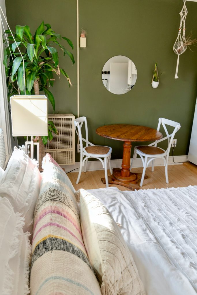
As for the effect green has on the human psyche: it evokes feelings of freshness, peace, and trust, and various shades are associated with food and the comfort it brings. Overall, green relaxes your senses, lowers blood pressure, and provides the calm needed to “counteract” more vibrant colors (like yellow and orange). Green brings with it the positive vibes of calmness, comfort, fertility, growth, harmony, protection, safety, and serenity.
Tread cautiously, however, with darker shades of green, which may evoke conflict, cowardice, greed, and jealousy. On the other hand, lighter and aqua shades of green offer calming effects. The shades run a variety of emotions as wide as the shade palette itself. For example, olive green is a worldwide symbol of peace and harmony. Perhaps that’s why Scouting America, formerly the Boy Scouts of America (BSA), chose it as part of the official uniform.
Some tips for using green:
– Vary shades throughout your home
– Opt for lighter shades on the walls with pops of darker shades with indoor plants
Blue
When it comes to blue, we’re hard pressed to find something bad to say about it – it’s the only color on the list that has an array of positive effects with little negative effect on the psyche. It also fits in with a number of other colors on the list and complements rather than clashes.
Although it may evoke sadness for some, it’s positive feelings far outweigh the one. It is considered to be among the most calming of colors in the interior designer’s palette. Some of its calming effects include relaxation of the mind, heart rate, metabolism, blood pressure, and more. Aquatic, sky, and light blue shades offer a healing effect for the mind.
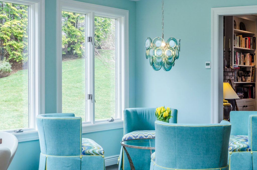
Some other positive emotions associated with blue include bliss, control, courage, faith, integrity, intelligence, knowledge, power, softness, and trust. Further, blue is associated with elegance, luxury, and prosperity.
Tips for using blue:
– There are no limits!
– Different shades can be used all over the house
– Use darker shades like royal blue as primary color
– Mix in neutrals or other colors (ex: yellow in kitchens or children’s play areas)
– Both dark and light tones can be used in bedrooms, dining rooms, and living rooms
– Keep it light in hallways, bathrooms, and other smaller spaces
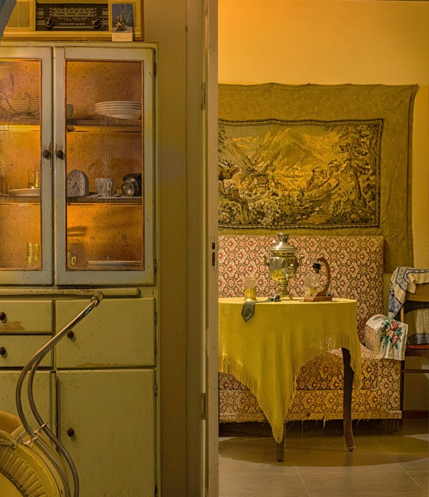
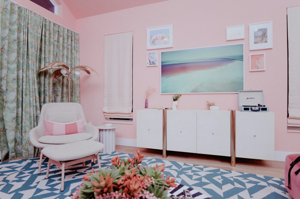
Purple
My favorite color! You’d think I’d put it higher on the list. Some associations of purple include a preference of younger people (teens), creativity, elegance, and royalty. Like many other colors on the list, the hue determines the vibe: plum and violet bring their brightness and flair, yet lavender and mauve offer calmness and a regal effect. Your choice of purple may bring to mind thoughts and feelings of luxury, richness, and sophistication. Drama, depth, excitement, mystery, and of course creativity are some of purple’s positive attributes. Various shades can evoke calm, relaxation, and tranquility.
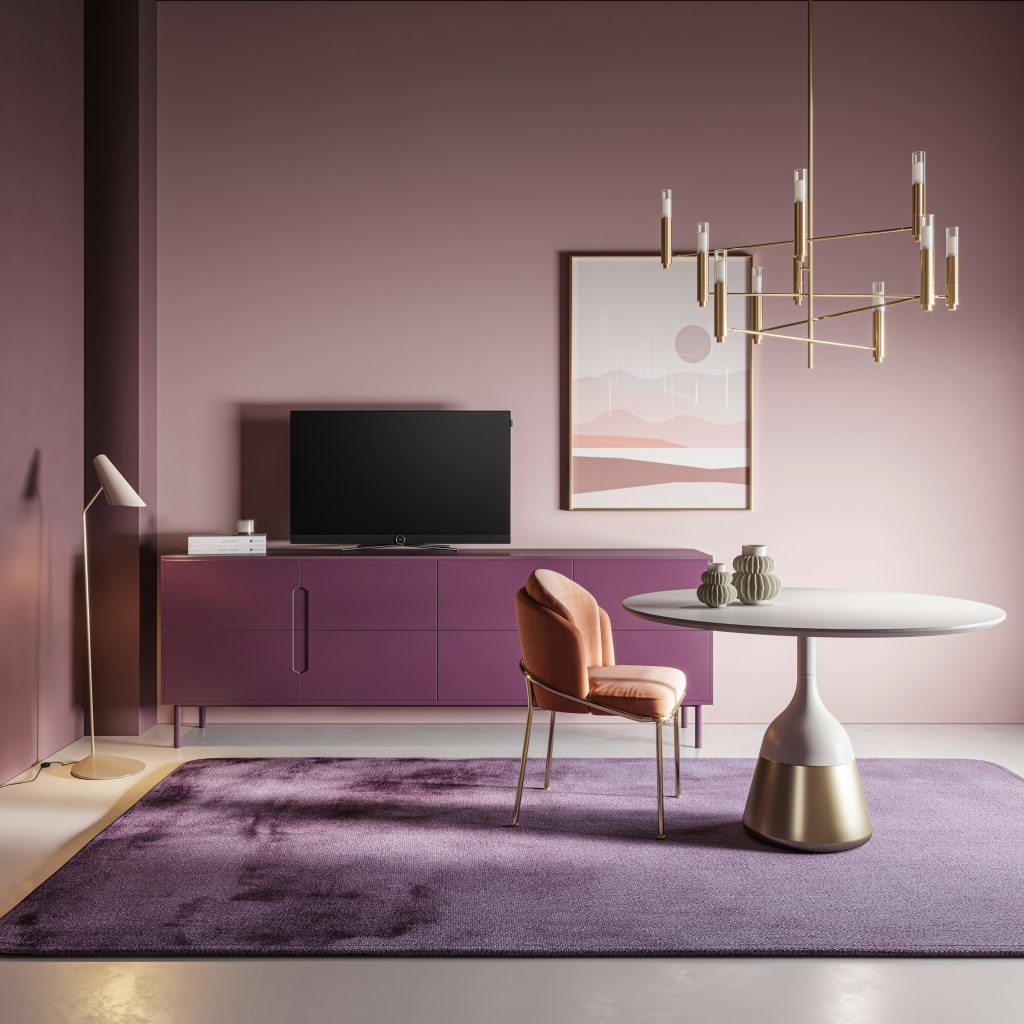
Tips for using purple:
– Spark creativity and use purple in dressing rooms, walk-in closets, kitchens, in-house studios
– Use regal shades in foyers, living rooms, great rooms, and other areas for guests/hosting (produce sense of calm, elegance, luxury, and welcome)
Pink
A shade of red, pink often evokes comfort, sweetness, warmth, compassion, love, nurturing, romance, and even cleanliness. These are just some of the emotions evoked by the color pink. The more vibrant shades of pink like magenta, fuchsia, and others, can be statement colors when paired with an “anchoring” shade like light blue. For form and function, pair it with neutral white. Yes, pink has negative traits as well: it may evoke feelings of compliance or loss.
Tips for using pink:
– Add in other colors to combat the extreme feelings evoked
– Neutrals add form and function
– Use pink in teen girls’ rooms, living rooms, bathrooms (or other rooms where joy and bliss are primary feelings)
Brown
We’re not saying don’t use brown, but you’ll want to use it sparingly and effectively to ensure it reflects comfort and warmth. Tread cautiously, as natural and soft hues relax the senses to the point of inactivity, lack of inspiration, and other negative effects you want to avoid.
Brown is associated with depression, indifference, isolation, and sadness. Conversely, it brings on emotions like comfort, dependability, determination, power, rigidity, safety, security, strength, sophistication, warmth, and many, many more.
Tips for working with brown:
– Pair it with vibrancy shades and hues of other colors (resilience and security)
– Potential colors: yellow, white, red, green, orange
– Explore textiles for unique ways to present brown
– Use it as an accent color rather than a primary color
Natural & Artificial Light
Color has some of the greatest impact of the personality and style you want to project in your home. It will influence the way you and your family feel, as well as any visitors. However, the way a space makes you feel and finding the perfect color palette for your home isn’t just about color, but light.
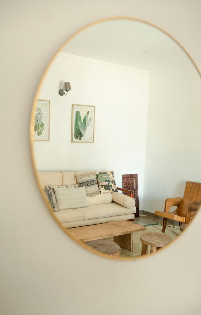
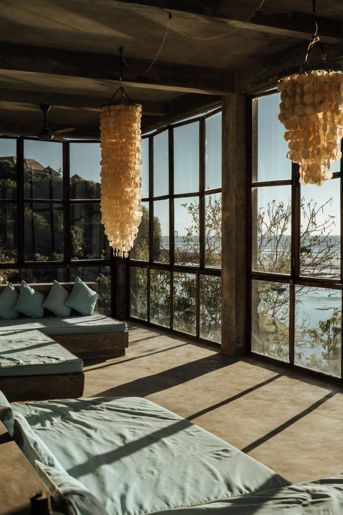
The light source, whether natural or artificial, has a great impact as well. Natural is best of all – considering its additional source of Vitamin D and other healing qualities, and you can design your home with sky lights, sun tunnels, and large windows to let in as much as possible. Natural light offers a unique finish to whatever color you decide to use in your home. The brightness and glow of natural light sets off each color and hue in a way artificial light will never duplicate. To take advantage of natural light, mirrors and white or light-hued walls paired with reflective surfaces like mirrors can capture the light and disburse it throughout the space.
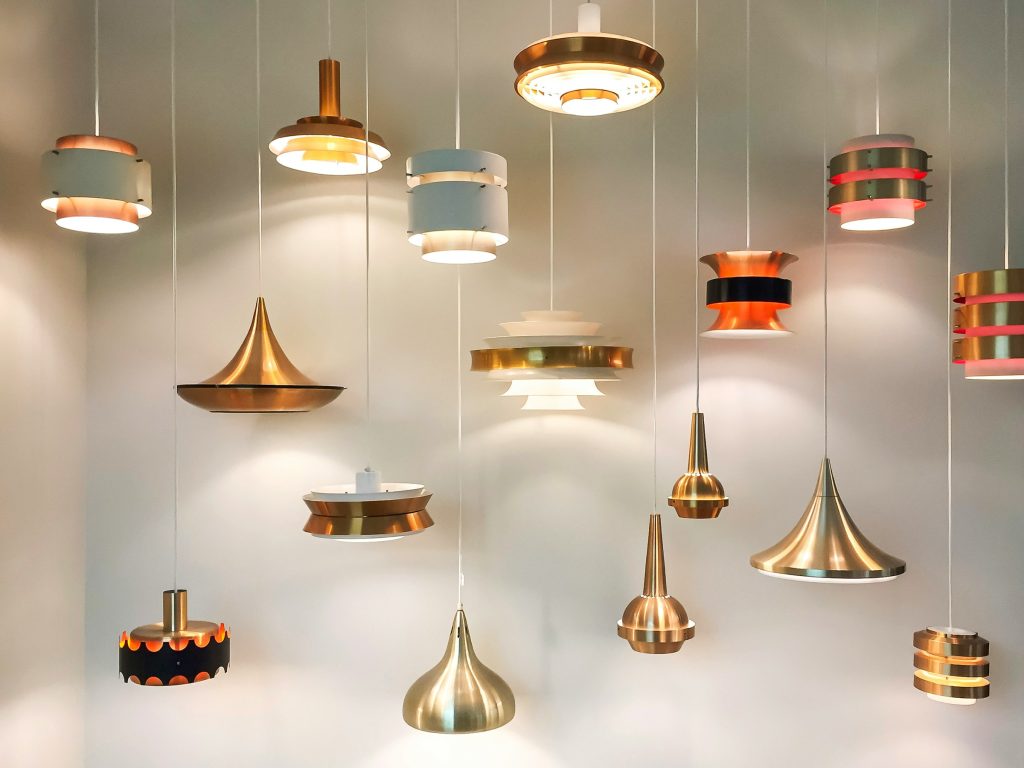
Artificial light has it’s place, of course, and provides its own unique effect. Sadly, it can’t bring the same warmth and health and healing effects as natural light, and needs to be positioned “just so” to create your desired effect. Choose all fixtures carefully, especially overhead fixtures since those are the fixtures that will cast the most light to fill a space similar to the sun. There are a variety of floor lamps, table lamps, and other overhead fixtures like recessed and track lighting that need to be mixed and matched precisely to create the impact you need and want.
Final Thoughts
There are dozens of shades of each color of the rainbow! There’s no one answer to using them to creating your perfect color palette for your new home. The staff and designers at Acipe Design help you create your dream home from foundation to completion. From choosing the fixtures for the bathroom sink to the color on the bathroom walls, we help design the home of your dreams.
Contact us today!